
back
back
When: 2019 - Ongoing
Roles: UX, UI, Product Design
Channels: iOS, Web
Client Project
Keyless is a pre-seed start-up that enables the easiest and most efficient way to explore and tour commercial real estate. It is a hardware+software solution that allows people to access commercial space automatically and without a broker or agent. I'm the sole/lead designer for the keyless team and am in charge or bring this new product to life.
This UX / UI case study focuses on the mobile app we are developing for keyless. The core functionality of the app is to act as a personal concierge for a lessee searching for a space to lease or purchase. It opens doors, provides all photographs and renderings of the property, act as a note taking interface, and instantly connect you to the brokers and agents representing the properties.
I began with an investigative mindset and interviewed a few people who I know are looking to lease a building. I was very fortunate to have additional help from a few of the founding members of my project team have leased buildings for small (and big) businesses before.
I sent out surveys and took phone calls with people living in Oregon to California to Texas to reference through the wire framing and UX process.
I organized these answers in a google sheet and began to draw some connections between all of their pain points and success points.
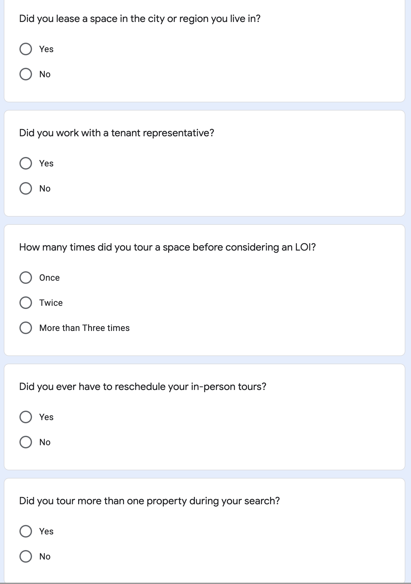
of users said they toured a property more than three times before considering and submitting an LOI.
of surveyed users viewed more than one property.
In a follow-up interview I learned that a single person toured more than 15 properties over 2 months.
people had to reschedule an in-person tour.
For this user journey I'll be focusing on a singular persona, 'Lena'. Lena is a friend of mine looking for to lease a retail space (allowing Lena to be incognito for their privacy) in Austin, Texas. We'll be going from the moment Lena decided to lease a space to the moment Lena would like to submit an LOI to the landlord or broker.

Lena is a small business owner in Austin, Texas who is looking to lease a medium-term (2-5 year) retail shop in the downtown area.
Lena is - Outgoing, Independent, a Self-Starter, Technology Literate
Lena's Goals:
1) Find a property on her own in less than six months.
2) Easily achieve this with collaborators and friends.
3) Continue to work as owner and operator of her business during this time.
Lena searches online:
Lena compiled a list of properties that fit her search criteria. The criteria itself narrowed the search much more than Lena herself.
Lena shares these properties:
WhatsApp and Facebook Messenger let's Lena share these properties with her coworkers and friends. They plan, together, to see as many as they can.
Lena begins touring:
Lena has a 'real-estate friend' who helps Lena get in touch with the brokers, landlords, and agents and setup visits to the properties.
Lena tours... and tours:
Lena tours seven spaces, most of them twice, and most of them with others (friends or collaborators) coming along if they can schedule it.
Lena begins to narrow:
Lena uses gmail, a g-sheet, and a google doc to narrow down the properties with her community. She creates a final list and tells her tenant representative ('real-estate friend') she's ready to begin negotiating and submit an LOI.
Lena helps negotiate the LOI
Lena and co use gmail to negotiate with the broker (and landlord) on the terms they agree with. Lena does a lot of waiting during this process.
Lena finalizes the LOI and begins move in!
Lena signs on the dotted line and begins moving into and renovating her newly leased space.
After listening to my follow-up interviews and diving deep with Lena, I started to mock-up as many flows as possible. The product features are very clear now and we can easily visualize what exactly we need to do to build an MVP that helps Lena as much as possible.
I divide up the flows by my 3 main features:
1) Search and locate
2) Browse and select
3) Tour
We can't replace the broker or agent with our base functionality so I won't scope in features like an LOI builder but can allow for any user to request a call or message to a broker or agent.
first iterations of the touring flow

Drilling down into the high(er)-fi mockups

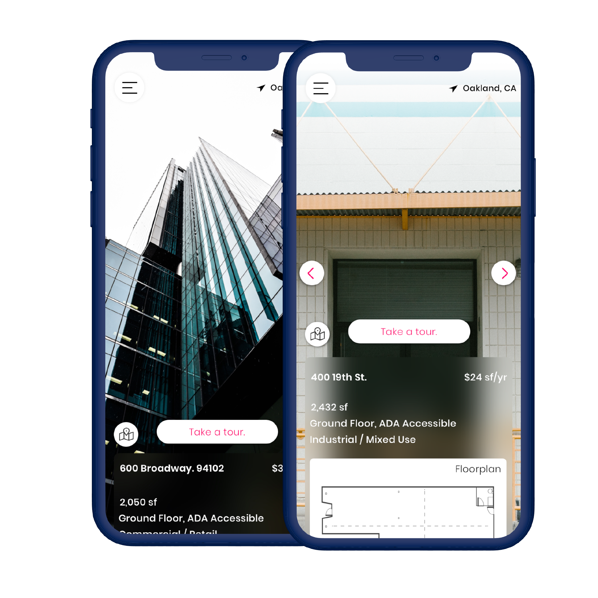
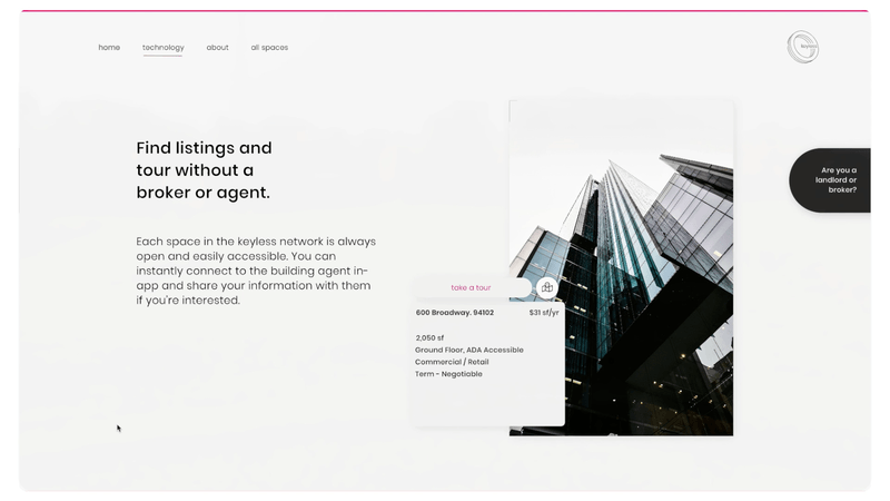
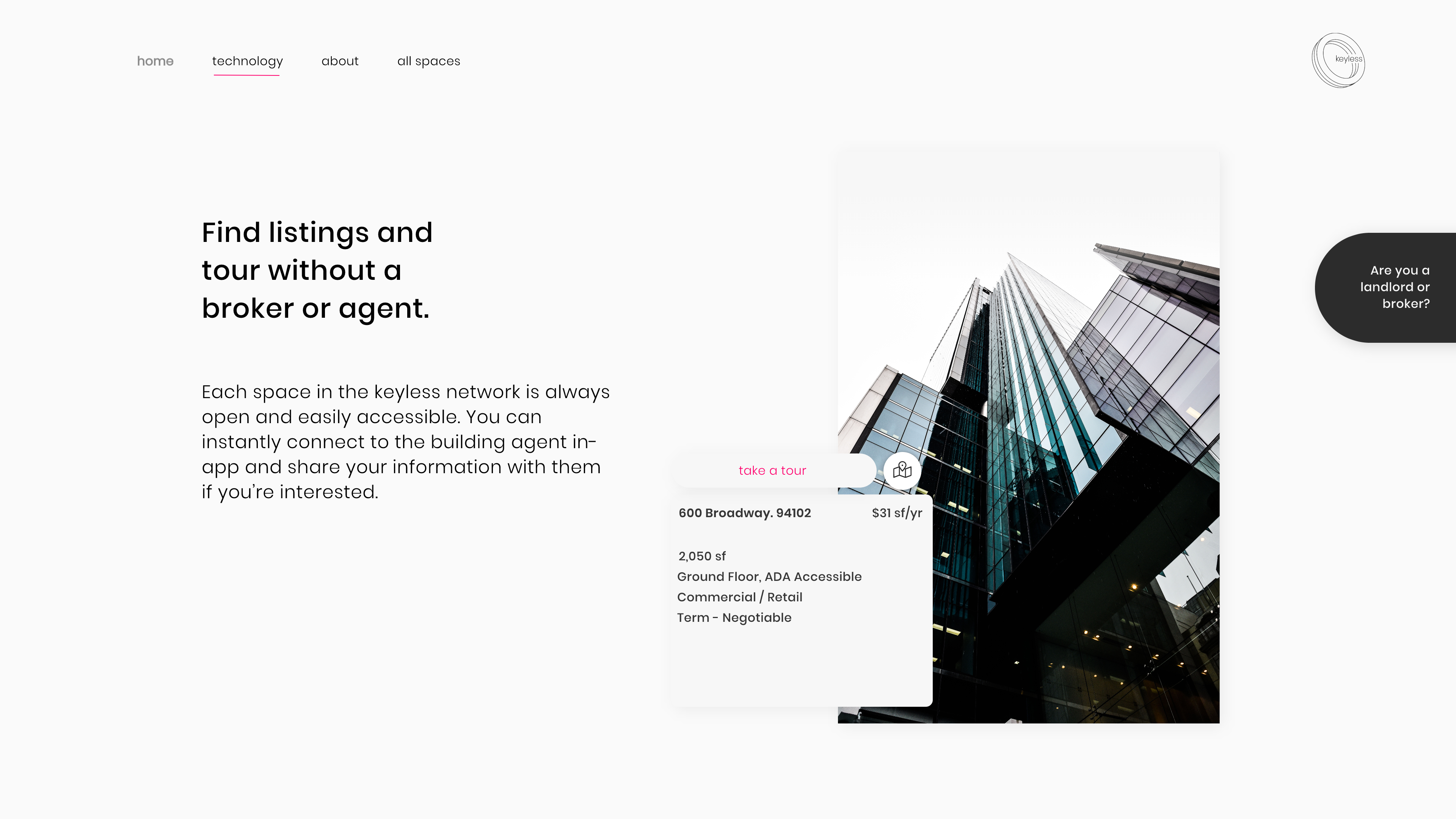
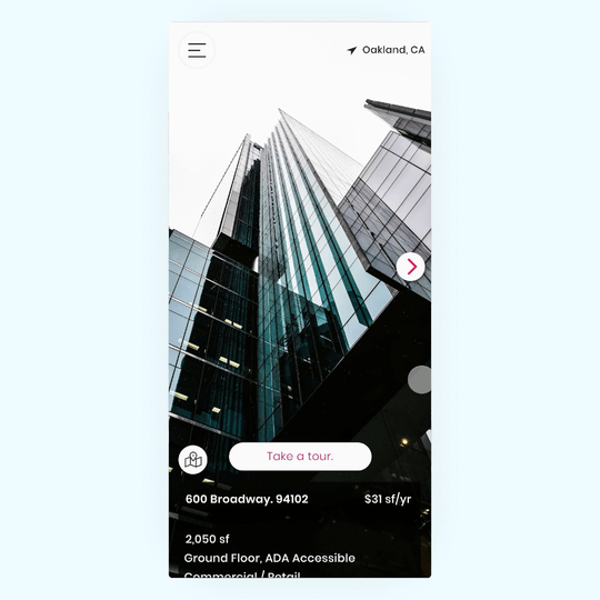
The app uses the new-yet-familiar map landing to orient our users and give them immediate access to each of the leasable spaces, their neighborhoods, and other nearby leaseable locations using our hardware & software solution.
While creating the hi-fi prototype I focused on features all potential tenants need to know and the two crucial features that make the keyless app unique.
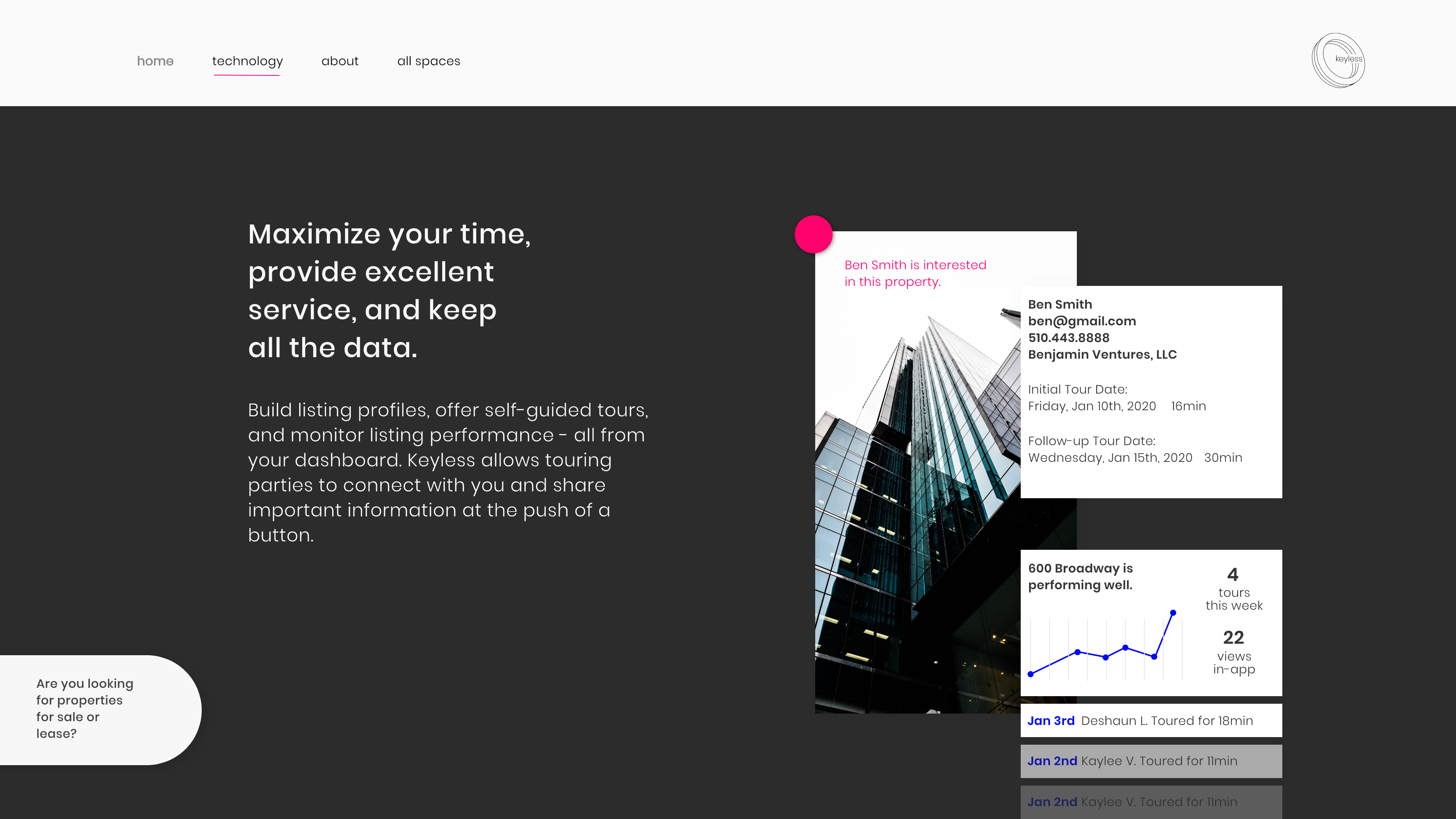
I always used black and white for the maps, cards, layouts, and structural elements of the UI while keeping my brand colors to only a two tone colorway.
The blue centers on the user and the users profile and is exclusively limited to either the position of or details pertaining to the user. The bright near-magenta keeps the eyes moving around points of interest like CTA's, building locations and need-to-know details.
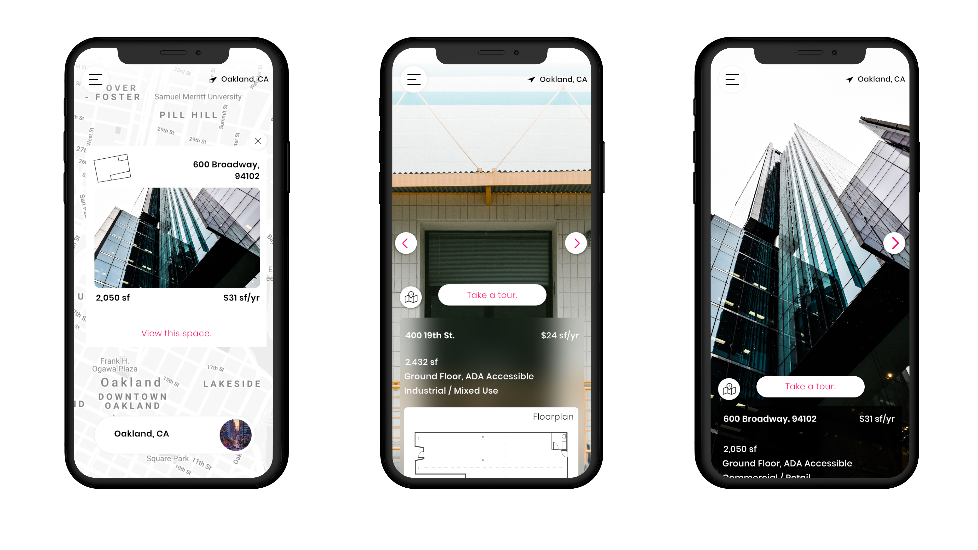
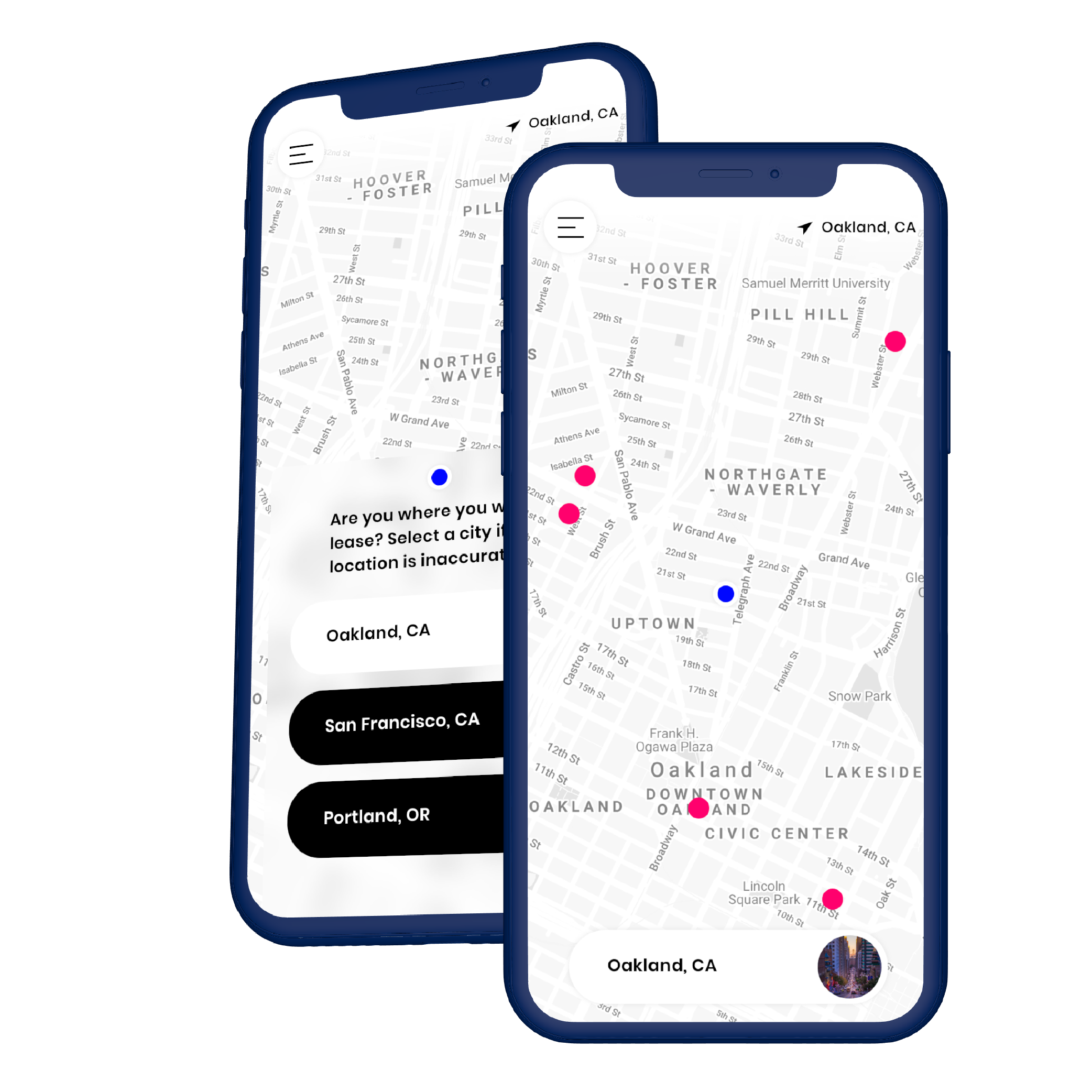
By showing all of the tour-able spaces in a given region, we'll ensure that the users can self-select from properties with guaranteed auto-opening doors for self-guided tours.
A small preview of the space along with the first few images is enough to plan a tour and share the property with any collaborators they need. We'll integrate with google maps to provide map details on how the user and their collaborators can get to the space.
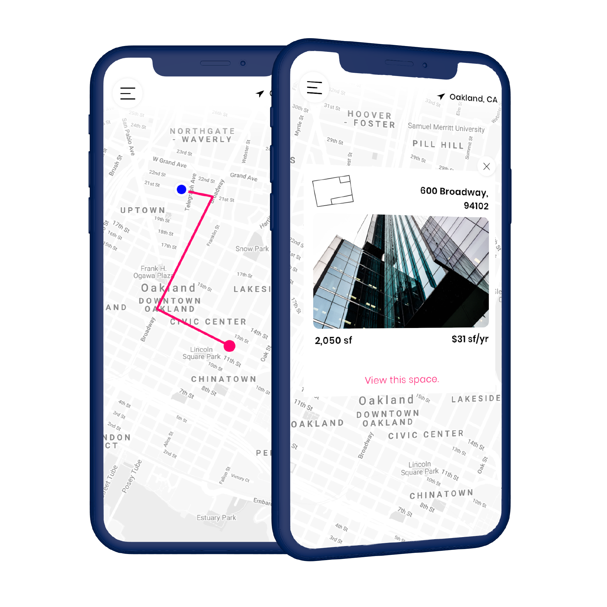
Every space on the app contains the most important data points - from square footage to floor plans to zoning - available to share, keep, and download as is needed.
This helps the users by giving them the most amount of information for their self-guided tour.
The two-sided nature of this product requires two separate landing pages for potential customers. Users of the application and dashboards will be both potential lease holders and landlords and they deserve separate landing pages.
I decided to be transparent and allow them to flip back and forth between each section. This builds trust and allows us to position ourself as a neutral tool that's as useful to one customer segment as it is to the other.
I've built a lo-fi inVision prototype for public viewing if you want take a look at the UX and copy writing we've done so far.
When designing this Brand ID with the small team of collaborators, we needed a logo, and we needed it in 3 days (you've all been there). It had to work in both digital and physical mediums, and be simple & 'millennial'. With these directives in mind and a sketchbook in-hand, I sprinted to finish this mark shown below.
The nature of Keyless is to be a recognizable tool for collaboration and access across storefronts, doors, and online property listings alike. This demands a logo and visual identity that plays well with others but is instantly distinct in nearly any situation.
Thus the "powered by" was born - a hopeful plan to create an access point technology that can be integrated with existing smart or electric lock styles.
As 2020 arrives, keyless begins its quest into reality. We've built the hardware, we've secured brokerage users, I've laid out the product design, and now we're off to the races with our beta testers. If you have any input or if this idea sounds like a fun - please reach out!
I've collected many whiteboard & sketchbook shots throughout my process on my process instagram.